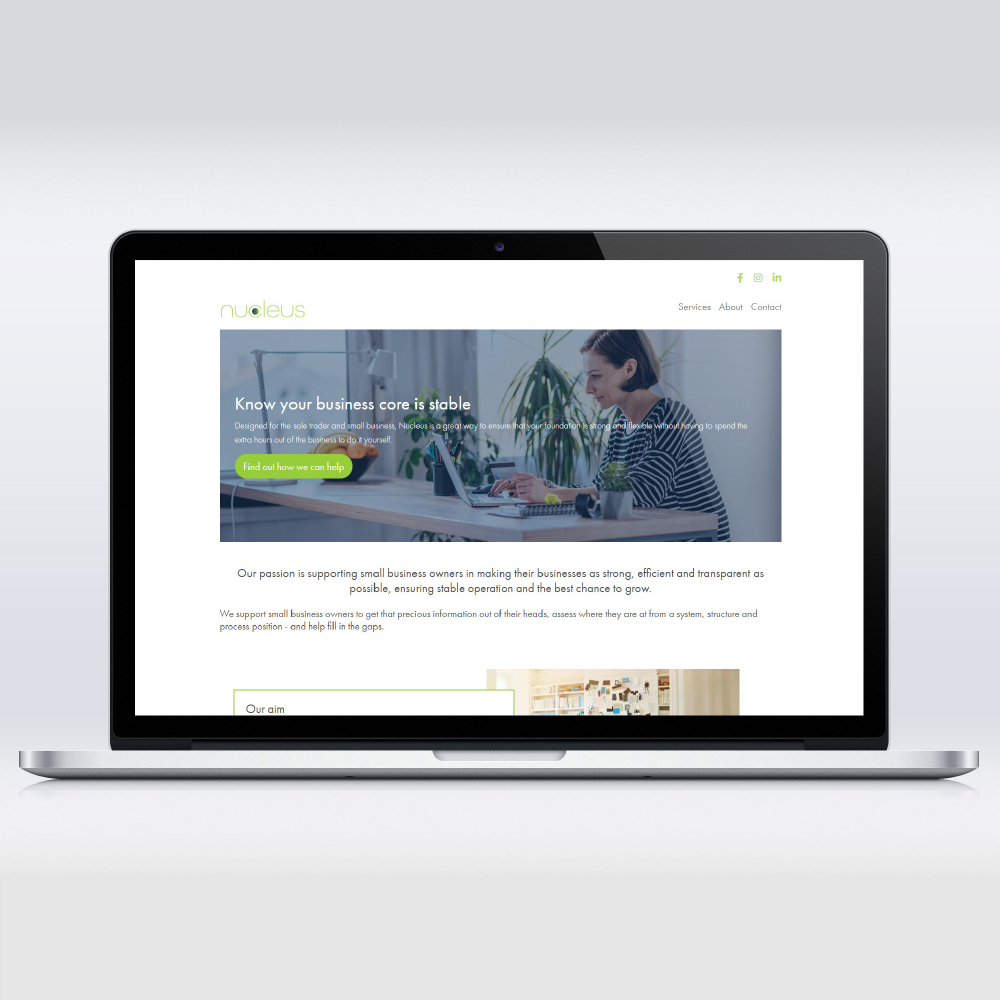
Nucleus offer a service to help business owners streamline their workflows and processes to make their business run smoothly and take some of the pressure off. We worked closely to come up with the right look and feel for their brand – clean and crisp – efficient!
Nucleus is all about getting your workflows in order to free up your time to focus on growing your business. They needed a brand identity to include logos, business cards and a website design and build.
Their ethos is built around having a solid foundation or core of easily repeatable and expandable workflows for your business. The idea of a core/cell nucleus gave rise to the circle within the ‘c’. The use of a gradient underlines the idea of a state of change and the typeface used in the font is clean and crisp to show maximum efficiency.
The colours chosen were in keeping with the owner’s own favourites using the contrast between the steady and reliable navy and the fresh and bright green. For the web design I wanted to keep things fresh and clean yet sophisticated while using images throughout to illustrate the copy well and give a friendly open feel.